There is a longstanding tradition of explaining many design choices in terms of emotions. When people discuss why they chose certain colors or fonts, they often refer to how they ‘feel,’ as if their emotions are enough to crown the chosen with all the power. An approach that makes the process look oddly mystical.
I recently came across an article on Creative Blog titled “The Psychology of Fonts: How Fonts Make You Feel.” It offered a few tips on what readers are supposed to feel about Garamond and Arial. While most readers don’t really have strong feelings about a font in the text, the article’s core idea wasn’t entirely off-base. In fact, I appreciated its conclusion that “People in 2025 won’t necessarily respond to a font the same way they would have in 2015 or 2005.”
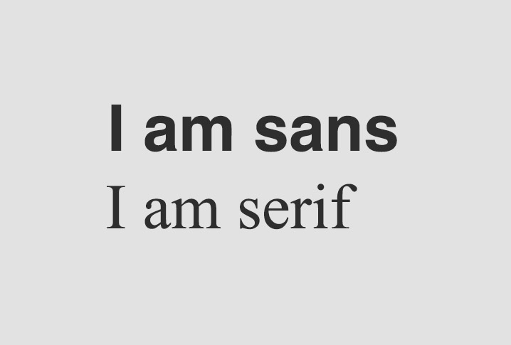
This point is important. But first, when we talk about fonts, we need to clarify that we can’t compare a font used for body text to one used for a logo or slogan. Today, I’m not focusing on logos or slogans. Instead, I want to address text fonts and the commonly held notion that serif fonts are associated with tradition while sans serif fonts are linked to modernity.
Context matters. Whether we like it or not, there is a practical, physical aspect to font usage. People read titles differently from long blocks of text, and there’s a long history backing this distinction.
When I was a student at the University of Printing Arts in 1997, I learned about two major book font categories: Banner Fonts and Text Fonts. Anything else was simply called “The Others.” Although this classification is an oversimplification, it was meant to emphasize a user-centric perspective: one group of fonts is for quick, short glances, and the other is for long reading, where the reader follows the text in detail. In articles and books, we read in longer “strokes,” so staying on track is crucial. A predictable rhythm prevents reader fatigue, and a simple visual structure helps locate key information. Meanwhile, a title is concise, intended to deliver its message at a glance. Essentially, some fonts work better for short text, others for long text. I hope Robert Bringhurst will forgive me for such a simplification, but I need it now to make my point.
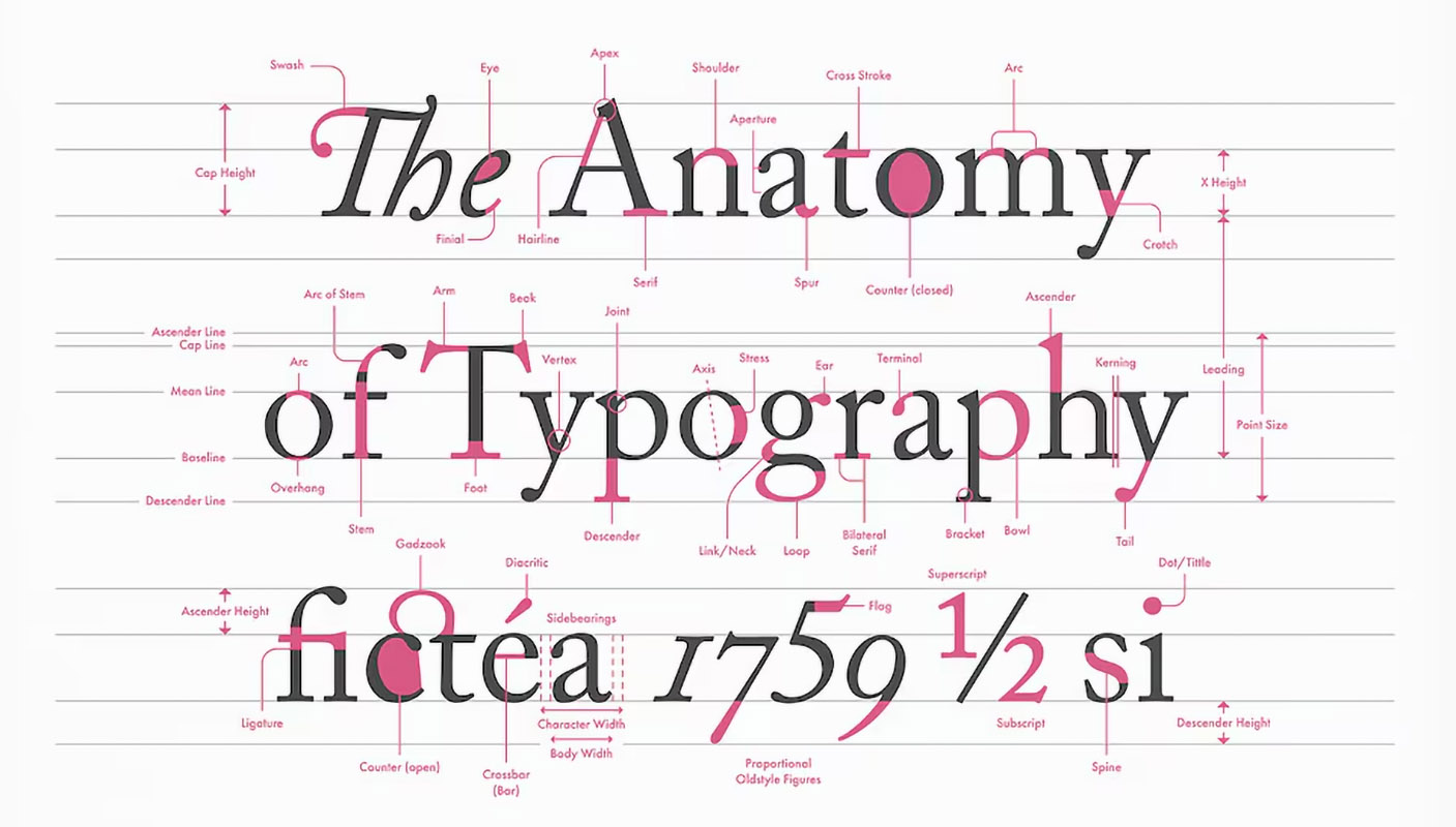
Typography as a whole is quite complex. Elements like ascenders, descenders, counters, loops, stems, apexes, and apertures all play significant roles in readability and accessibility, both on their own and in combination. For instance, consider fonts like OpenDyslexic or Atkinson Hyperlegible which meticulously apply the principles of font anatomy to create designs that specifically assist individuals with reading difficulties. Understanding these principles is equally crucial when taking a user-centric approach to font choice and exploring the differences between Serif and Sans Serif.
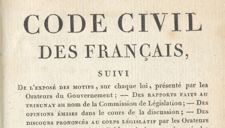
From the Gothic script of the Middle Ages and Gutenberg’s movable type in the 15th century to modern type design, people have created fonts for extended reading. This is why serif fonts exist. They weren’t introduced to evoke emotions but rather to aid legibility.

Even when aesthetics were important to them, user-friendly design remained the priority. Good thing they didn’t have to worry about likes or a comments section back then.
So why do we see so many long-form texts in sans serif if serifs were traditionally intended for lengthy reading? One major turning point was the rise of personal computers. In the early days of low-resolution screens, fonts had to fit into an 8×8 pixel grid, which made detailed serifs hard to render. Consequently, sans serif fonts became associated with modern technology.
I recall my first job as a Graphic Designer for an agricultural trade journal in the early 2000s. My boss insisted on using a sans serif font for article text because it appeared more “modern.” He was still influenced by that early digital revolution, when anything produced by a computer felt fresh and cutting-edge.
Should we only use serif fonts for long reads? It depends on the context. If I’m designing a full article, I usually encourage clients to use serif fonts for readability. If I’m creating short descriptions or notes, such as social media posts, sans serif can work just fine. It all comes back to a user-centric approach: How easily should the text be digested? Is the reader following lengthy sections of text, or just skimming? What about paragraph spacing or section spacing for visual hierarchy? Once we consider the text’s purpose and how it’s read, choosing the right font is much more straightforward.
The cover image by Norman Rockwell’s 1944 painting “Which One?”
Rise of the Digital Fonts
Hidden Sheep and Typography Archaeology
The Elements of Typographic Style
The Dos and Don’ts of Pairing Typefaces
Serif vs. Sans-Serif Fonts for HD Screens by Jakob Nielsen


