I’ve recently subscribed to an online magazine Metropole. It’s a small and dedicated team is running a magazine for English speaking expats in Vienna, Austria. For a small fee, you can get a version of the magazine to read in spreads, as you would do with a usual paper magazine. I guess you can see it as a homage to a very conservative Austrian society, that would still read articles in spreads even it’s not really comfortable to do on any digital devices.
I’ve spent a significant amount of time designing magazines at the beginning of my career. Since I still have some feelings for this job I found myself somewhat unconsciously collecting feedback while reading this magazine. Honestly, I want to say overall I love all the stories in Metropole. I do like that apart from photos they use drawn illustrations and infographics. Even the drop caps are used only after the first paragraph. But then, I bet any designer would cringe looking at this:
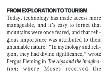
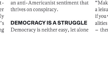
Nobody messes with the kerning! I guess they’ve got the whole mess with kerning probably because of the incorrect use of hyphenation and fully justified blocks of text. But why would anyone use fully justified text in a magazine? It’s not a book.
I can imagine what pressure the designer is experiencing at Metropole. The magazine is 148 pages thick and appears every 3 months. Even if they have all the texts beforehand it still means the designer has to do 2 pages every working day. There would be no time to make a beautiful font design. I feel sorry for him/her.
Back in the day, I was given great advice by one prominent designer:

This, a bit of self-indulgencing rule, especially works when you’re under time pressure and the only source for images you have at your disposal is Unsplash and Freepik. There are plenty of ways to keep good execution without breaking the records in making new awesome Graphic ideas. Below I want to mention just a few ones, that helped me. And I would like to show the proof for these rules on the example I’ve done by redesigning one of the spreads from the current issue by Metropole. Grab the slider and move it to the left to see my version.
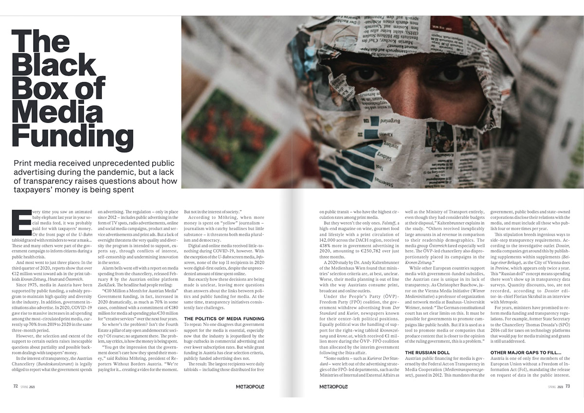
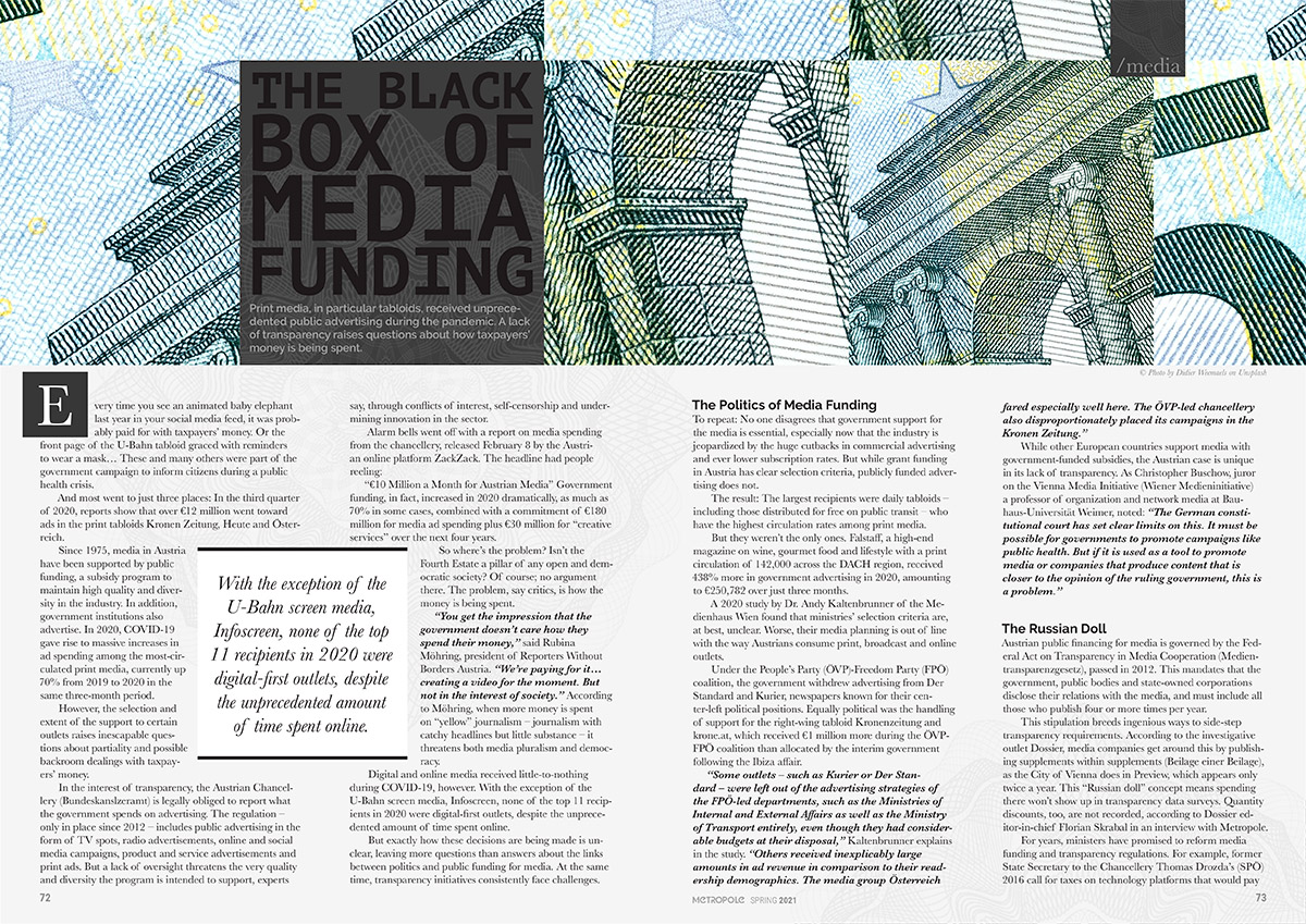
- If you don’t have a very good photo (I mean it, a REALLY good photo) for an article try something abstract, don’t take any photo. Article without a photo is better than with boring or bad photo,
- If you can use some design as an illustration, like a guilloche pattern from money bills I used above, it’s a double win since it’s already decorative and you don’t need to beautify it,
- Don’t use only high black&white contrast. Try to find other shades in between for texts, titles and other elements. In web design, for example, it’s already a rule of thumb not to use 100% black (#000) for the titles,
- Use Fully Justified text for the Body text only if you’re going to use more than 60 characters in a line for a column,
- Pay attention to the rules of Hyphenation and Optical Margin Alignments. Such details are making your text look very accurate,
- I’m not sure if I still have to mention it, but never, never ever mess with the kerning!
- Try to break the blocks of text visually, so a reader would able to jump between the pieces of text,
- If there are no pull quotes, there is always something to emphasize in the text, numbers, titles, names. The Body text should always entertain,
- Try to give a sense of structure with Byline, Header, Category name etc.
- Choose typography appropriately. Among many different websites, where you can check the fonts I do like FontPairings by People
Once again, I really like the magazine and I am looking forward to seeing more interesting stories and news about Viennese society.
